Monday, September 15, 2008

Final - Reference & Thematic Maps of Iraq


US Casualties in Iraq War

The Iraq War or the Second Gulf War has been in the United States geopolitical forefront well prior to its occupation of Iraq on March 20, 2003. Due to September 11, 2001, United States national security and geopolitical policies morphed to suppress the rise in global terrorism. United States and Coalition forces occupation of Iraq has been prolonged due to a rise in insurgency. Insurgents have caused the most havoc and deaths to U.S. soldiers in Iraq via improvised explosive devices (IED). Whether the United States and Coalition forces will leave Iraq with positive affects/outcomes is yet to be determined, only time will tell. Our final project for this crash course in the Introductory to Geographic Information Systems is one, to create a reference map illustrating Iraqi cities, provinces, and major rivers; and two, to create a thematic map of Iraq to display the spatial distribution of U.S. Casualties throughout Iraqi provinces.

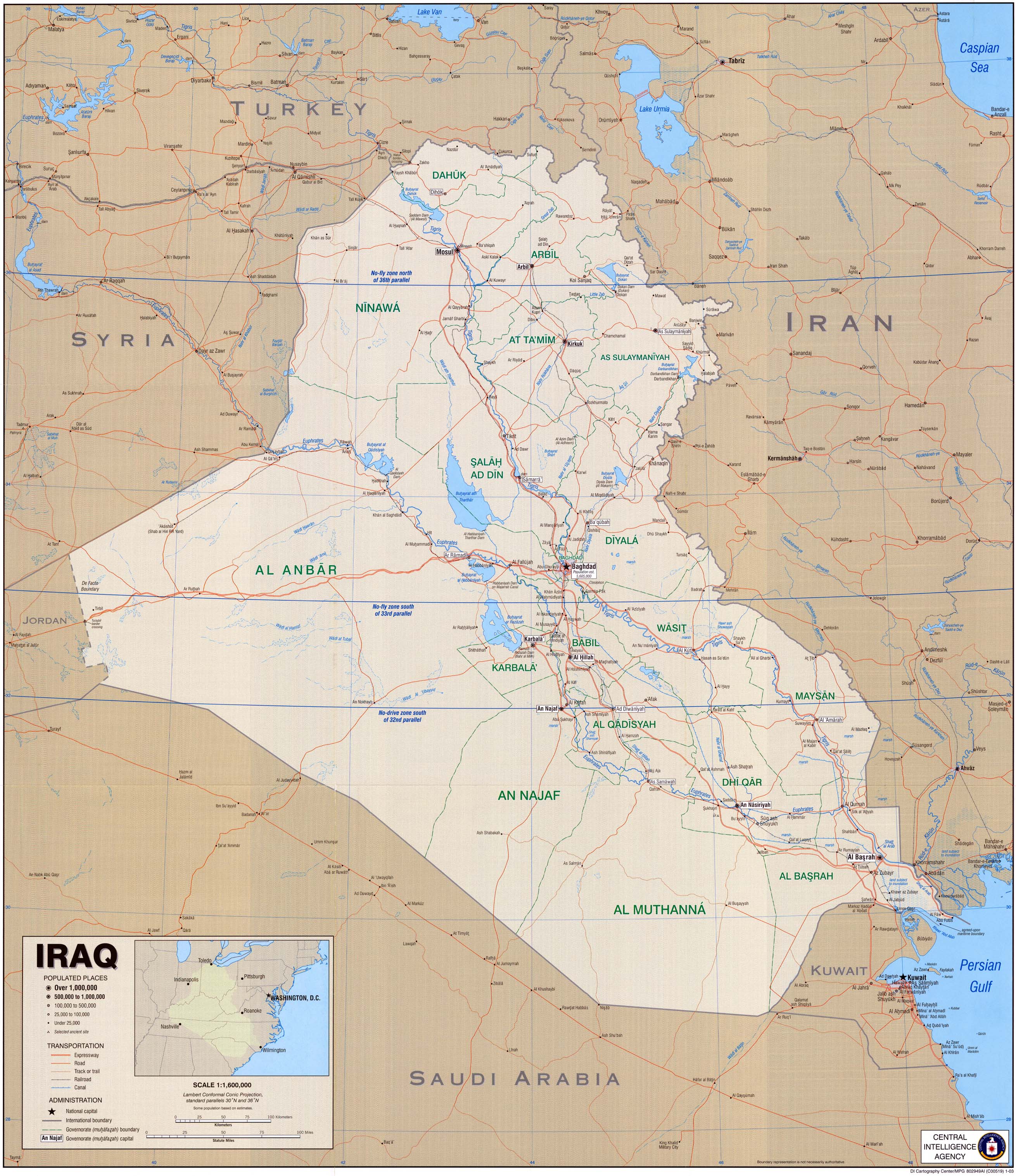
The first map is a reference map of Iraq which I created by geo-referencing and digitizing the below mentioned cited map. Three layers were created: provinces, rivers and cities.
Data source cited for the reference map of Iraq titled, “Political Map of Iraq:”
Central Intelligence Agency (CIA) 2003. Iraq [map/j-peg]
Langley, Virginia. Central Intelligence Agency (CIA). University of Texas Map Library [distributor] http://www.lib.utexas.edu/maps/middle_east_and_asia/iraq_cia_2003.jpg

The second map is a thematic map of Iraq displaying U.S. casualties per province. A yellow/red color gradient was used to show five different numeric ranges of deaths within all 18 Iraqi provinces. This allows the reader to be visually aware of the spatial distribution of deaths in Iraq. The reader can refer to the legend to find the range of deaths in each respective province. The province of Baghdad boasts the highest number of U.S. casualties to date, 1,305 deaths since March 20, 2003. Al Anbar province has the second highest death count, 1,302. The number of deaths for the third highest province, Salah Ad Din, is significantly less with 396 deaths to date. These three provinces share a common characteristic; they are located in the center of Iraq in highly populated areas. The next nine Iraqi provinces with a significant amount of deaths also follow a trend. They all lie within or border the Tigris and Euphrates Rivers. The majority of Iraqi cities are located along these two major rivers. The last six provinces fall under the category of having the least amount deaths, zero to thirteen, or yellow category. These provinces are adjacent to the border of Iraq and are scarcely populated.

Another common trend I noticed in researching U.S. Casualty Count in Iraq, which is not mentioned in thematic map, is the significant decrease in deaths per year in each province since the U.S. troop surge. There is an average of 75% less casualties in each province year to date in 2008 from 2007. There is still 25% of the year left in 2008 but it is so significant, I feel it is imperative to note! Two GIS maps can be made to show the difference in number of deaths per year and the percent change. This can be useful for the military as they have specific coordinate information regarding the casualties and can concentrate thier efforts in specific regions accordingly. Or it can be used for simple propraganda.

Data sources cited for the thematic map of Iraq, titled, “US Casualties in Iraq:”
Central Intelligence Agency (CIA) 2003. Iraq [map/j-peg]
Langley, Virginia. Central Intelligence Agency (CIA). University of Texas Map Library [distributor] http://www.lib.utexas.edu/maps/middle_east_and_asia/iraq_cia_2003.jpg

United States Department of Defense (DOD) 2008 / USCENTCOM 2008 [publishers]
Arlington, Virginia. U.S. Department of Defense / Tampa, Florida. CENTCOM
icasualties.org 2008 [distributer] Coalition Deaths by Province (US only) [table/online]
Extracted, September 15, 2008
http://icasualties.org/oif/Province.aspx


Friday, September 12, 2008

Lab 3 Willow Fire Analysis

1999 Willow Fire Analysis

The 1999 Willow Fire in San Bernardino County, California, was one of the worst forest fires in recent history. The fire began on August 28, 1999, approximately 90 miles east of Los Angeles near Lake Arrowhead. The fire lasted seven days and burned approximately 68,723.5 acres or approximately 107 square miles of vegetation in the San Bernardino National Forest and private land per the data provided in the map above. This fire threatened the resort towns of Big Bear and Lake Arrowhead. The fire was declared contained on Saturday, September 5, 1999.

The map above illustrates the spatial analysis of burnt vegetation in the 1999 Willow Fire. There are six polygons representing the different types of vegetation within the burn area of the Willow Fire which are as follows:
1. Coastal Scrub – 14% of total area burned in acres
2. Desert Scrub – 26% of total area burned in acres
3. Juniper – 14% of total area burned in acres
4. Montane Harwood-Conifer – 11% of total area burned in acres
5. Pinyon-Juniper – 32% of total area burned in acres
6. Urban Agriculture – 3% of total area burned in acres

This map was created using daily observations and surveys of the area burnt during the Willow Fire. The overlapping areas represent the vegetation that continued to burn between the daily observations. To create a map of the total burn area of the six polygons, the Union and Dissolve functions were utilized in Arc Toolbox. The unit of measurement used for the area of these polygons is meters. The areas/polygons (in meters) were then converted to acres to find the percentage of total area burnt for each vegetation type.

The largest areas burnt, according to the above vegetation analysis, consisted mostly of Pinyon-Juniper and Desert Scrub. Pinyon-Juniper vegetation is generally found in the western United States between 5,000 and 7,000 feet. This vegetation has evolved to be resistant to cold weather and drought. It is usually found bordering Desert Scrub and Montane Forests in higher elevations. (spuds.agron.ksu.edu/Pj.htm)

High winds, low humidity, and arid vegetation combined to make this a devastating fire. Wind created by the high temperature fire may have caused one vegetation type to burn more than another. Fire usually follows the path of least moisture; in this case it would burn across the Desert Scrub. Some species of vegetation, such as Montane Hardwood-Conifer and Pinyon-Juniper, necessitate fire to reproduce which allows their seeds to germinate without competition for light and water.

Geographic information system technology helps us understand the spatial characteristics of phenomena. The map above can be used in several different ways:
Ø Fire containment under similar ecotopes (Tansley) and conditions.
Ø Replanting vegetation
Ø Soil rehabilitation according to the vegetation type

Thursday, September 11, 2008

Lab 2 Census 2000


Census 2000

The United States government administers a census every 10 years to acquire information regarding all the members of its population, citizens and non-citizens alike. Its primary function is to enumerate information allowing the government to accurately allocate congressional seats, electoral votes, financial and other government funded assistance. Through the census procedure the government compiles and stores information in a multitude of categories. This information is easily found on the census.gov website and is used by the government and public to see numeric trends and patterns throughout the nation. This enumeration of information may be used in conjunction with geographic information systems to visually project all of these tabulated trends. An example of creating a geographic information system using attribute data from census.gov, a secondary source, is creating a map displaying the spatial distribution of different races by county. This is done by properly joining attribute tables from census.gov to an attribute data table from a geographic information system via a common factor. In the maps above, the county shape file attribute tables were joined to the ranking tables by race alone through state and county FIPS codes.

The first map above is a geographic information system depicting the percentage of Asian population density per county. It is projected in a North American Lambert Conformal Conic format. A grayscale is used to show the different densities of population, darker being higher density. The Asian population is concentrated along the coasts, most notably the West Coast. Honolulu County has the highest percentage Asian population in the United States. Besides Hawaii, California is home to the majority of counties with the highest percentage of Asians. On the East Coast, the highest concentrations of Asians are located in counties within the New England states. Mid-west counties as a whole have the least percentage of Asians.

The second map above is a geographic information system displaying the percentage of Black population density per county. This map is also projected in a North American Lambert Conformal Conic format. It is quite visible that the Black population is concentrated in the “Bible Belt” or south eastern United States. Mississippi and Alabama have the counties with the highest concentration of Black people in the United States. Jefferson County, Mississippi boasts the highest percentage Black population, 86.5%. There are a few locations outside the “Bible Belt” near major cities with a relative high percentage of Black population.

Last but not least, the final map illustrates the spatial distribution of some Other race stand alone across the United States, by percent. This map was created with a GCS_Notrh_American_1983 projection. This map projection is not common but was used to show the difference between the two different map projections. The highest concentration of Other race population is located in the south western United States along the Mexican border. Sunbelt States from the Northwest to Texas hold significant concentrations of Other race but the trend stops in Louisiana. The Sunbelt states of Texas, New Mexico and California are home to the counties with the highest percentage of other race population. Imperial County, California holds the highest percentage of Other race population, 39.1%.

Wednesday, September 10, 2008

Lab 1 Map Projections


Map Projections

Our beloved Mother Earth can be displayed as a flat map through a variety of projections. These different projections transform Earth’s spherical surface to a plane or flat medium (i.e. paper or computer screen). A map projection is “a systematic arrangement of parallels and meridians on a plane representing the geographic coordinate system.” (Chang, pg.24) Map projections cannot transform Earth’s three-dimensional curved surface to a two-dimensional surface without a relative degree of distortion in true shape, area, distance and/or direction. At the same time, a flat map would be non-existent without a map projection because a sphere cannot be laid flat over a plane without a certain level of the above mentioned distortions. Even a globe is relatively distorted due to the actual shape of the Earth being an oblate spheroid, not a sphere. Although map projections cannot rival the accuracy of a globe, map projections offer a variety of advantages such as portability, range of scale, range of view and affordability. For these reasons, map projections are widely used and are imperative to spatially depict geographic references on a flat medium.
Conformal map projections preserve angles locally and maintain shape. Every parallel intersects the meridian at a 90 degree angle. Mercator and Gall Stereographic are two examples of conformal map projections. In the Mercator map, the Rhumb lines are represented by straight lines making the poles look larger distorting size increasingly further away from the equator. Notice the area of Antarctica is equal to or greater than the total area of all other continents combined. The Gall Stereographic map preserves the shape of circles and distorting area, specifically near the projection point. For obvious visual reasons, conformal map projections are not ideal for world maps.

Equal-area map projections preserve area; all the features on the globe are kept to scale. Bonne and Mollweide are two examples of equal-area map projections. In these maps the features are kept to scale at the cost of shape. The Bonne map projection maintains accurate area along the central meridian and standard latitude. The Mollweide map projection sacrifices fidelity of angle and shape in favor of accurate depiction of area. Mollweide projections are most commonly used for global maps.

Equidistant map projections preserve distance from a point or line at the meridians and standard parallels at the expense of area and shape. Cylindrical and conic equidistant map projections were used as examples. Cylindrical equidistant projections are the simplest map graticule dating back to approximately 200 B.C. and was used for navigation until contemporary times. It is often used for topographic maps. Equidistant conic projections maintain constant parallel spacing and are acceptable for mapping temperate nations.